Every now and then my brain gets stuck in a thought-groove. For example, the other day I reached into our fridge and grabbed a cucumber…
Before I go any farther, I just want to point out that this post is entirely the cucumber’s fault.
Cucumbers bring out the worst in me; especially Long English cucumbers. I can’t even buy them in the grocery store without smirking. There’s something about publicly sorting through a big pile of phallic objects that just tickles my funnybone. Should I get the ridiculously-long-but-skinny one or the one with average length but jaw-dropping girth? Will the checkout cashier judge me by my choice?
If I think about it too much, I can’t repress my smile; which only escalates the situation. ’Cause the only thing worse than publicly sorting through a big pile of phallic objects is doing it while wearing a guilty grin. When I catch myself furtively glancing around to see if anyone’s watching, I know it’s time to just grab the first available cucumber and get the hell out of the produce department.
(I’d also like to note that I’ve never seen a man buy a Long English cucumber. Not once. Talk about intimidation.)
But I digress, as usual.
So, anyway… I reached into our refrigerator and grabbed a cucumber, and it squished. Eeuw!
Quoth I to Hubby, as I disposed of the slimy remains: “Liquidity: A good thing for investments; not so good for cucumbers.”
Then my brain wouldn’t let it go. It turns out there are a lot of words that rhyme with ‘liquidity’, and most of them have good and bad connotations. Such as…
Frigidity: Good for popsicles; bad for bedmates.
Rapidity: Great for cheques arriving in the mail; not great for bills arriving in the mail.
Solidity: Good for chocolate bunnies; bad for ghosts.
Aridity: Nice for armpits; not-so-nice for climates.
Rigidity: Bad in attitudes, but great in a… *ahem* …tool. (Would you believe I was talking about the Ridgid brand name? No? Okay, fine; you got me. *snickers*)
Flaccidity and tumidity: Not even going there.
Stupidity: Just never good.
I had more, but I decided not to belabor the point. (You’re welcome.)
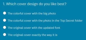
But speaking of belaboring the point: Many thanks to everyone who weighed in on my proposed cover design last week! The majority indicated that the original covers were better, although some people said it might be interesting to see a design that used some elements of both. So here’s my next attempt:

And then (because I can’t leave well enough alone), I also did a version with the photo clipped into a “Top Secret” file folder.

Here it is in blue/green just for variety (because if I go with the bright design, each book’s cover will be a different colour under the yellow titles):

Or… here’s the original cover with an updated font and series number:

Or am I over-thinking the whole thing? Here’s the original cover:

Please click on the one-question survey below for a quick vote:
And as always, if you have comments I’d love to hear them. Thanks for helping to preserve my tiny fraction of remaining sanity!
P.S. None of this craziness is my fault — the cucumber made me do it! 😉