Every now and then my brain gets stuck in a thought-groove. For example, the other day I reached into our fridge and grabbed a cucumber…
Before I go any farther, I just want to point out that this post is entirely the cucumber’s fault.
Cucumbers bring out the worst in me; especially Long English cucumbers. I can’t even buy them in the grocery store without smirking. There’s something about publicly sorting through a big pile of phallic objects that just tickles my funnybone. Should I get the ridiculously-long-but-skinny one or the one with average length but jaw-dropping girth? Will the checkout cashier judge me by my choice?
If I think about it too much, I can’t repress my smile; which only escalates the situation. ’Cause the only thing worse than publicly sorting through a big pile of phallic objects is doing it while wearing a guilty grin. When I catch myself furtively glancing around to see if anyone’s watching, I know it’s time to just grab the first available cucumber and get the hell out of the produce department.
(I’d also like to note that I’ve never seen a man buy a Long English cucumber. Not once. Talk about intimidation.)
But I digress, as usual.
So, anyway… I reached into our refrigerator and grabbed a cucumber, and it squished. Eeuw!
Quoth I to Hubby, as I disposed of the slimy remains: “Liquidity: A good thing for investments; not so good for cucumbers.”
Then my brain wouldn’t let it go. It turns out there are a lot of words that rhyme with ‘liquidity’, and most of them have good and bad connotations. Such as…
Frigidity: Good for popsicles; bad for bedmates.
Rapidity: Great for cheques arriving in the mail; not great for bills arriving in the mail.
Solidity: Good for chocolate bunnies; bad for ghosts.
Aridity: Nice for armpits; not-so-nice for climates.
Rigidity: Bad in attitudes, but great in a… *ahem* …tool. (Would you believe I was talking about the Ridgid brand name? No? Okay, fine; you got me. *snickers*)
Flaccidity and tumidity: Not even going there.
Stupidity: Just never good.
I had more, but I decided not to belabor the point. (You’re welcome.)
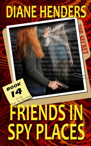
But speaking of belaboring the point: Many thanks to everyone who weighed in on my proposed cover design last week! The majority indicated that the original covers were better, although some people said it might be interesting to see a design that used some elements of both. So here’s my next attempt:

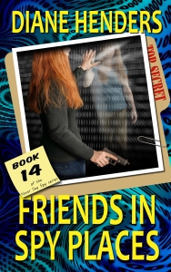
And then (because I can’t leave well enough alone), I also did a version with the photo clipped into a “Top Secret” file folder.
Here it is in blue/green just for variety (because if I go with the bright design, each book’s cover will be a different colour under the yellow titles):
Or… here’s the original cover with an updated font and series number:

Or am I over-thinking the whole thing? Here’s the original cover:

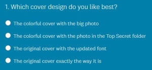
Please click on the one-question survey below for a quick vote:
And as always, if you have comments I’d love to hear them. Thanks for helping to preserve my tiny fraction of remaining sanity!
P.S. None of this craziness is my fault — the cucumber made me do it! 😉

It would be fun to follow you around in a grocery store Diane. Watch for hidden cameras is my advice.
I detest the finding of slimy vegetables. One i can’t stand to touch them and two I’m always so mad I let them go to waste.
As to the book covers I am apparently completely off the mark compared to most so won’t give another opinion here. Clearly what do I know about book covers? I do know i loved what was inside. Any more audio books in the making by any chance?
LikeLike
Yes, I’m in the process of negotiating to have the rest of the audiobooks finished up! It’s been a slow process but I’m hoping to see some progress soon.
And I’m still poking at the cover designs a bit. (Shhh, don’t tell.) The problem with my survey here is that I’m asking the people who have already bought the book whether they liked its cover. But what about the people who didn’t buy the book? Would they have looked twice at it with a different cover? So confused… *sigh*
And I’m always watching for hidden cameras, in the produce department and elsewhere. I probably don’t want to know what that says about me. 😉
LikeLiked by 1 person
So happy to hear about the audiobooks!
LikeLiked by 1 person
Cucumbers have a tendency to do that, Diane.
I always have to buy a whole cucumber. I just cannot buy one that’s been chopped in half.
LikeLike
That would just be WRONG! *shudders*
LikeLike
Cover – blue with the top secret folder.
Cucumbers, gee thanks. Just bought a regular, fat one of good girth tonight at the grocery store. Aww nuts. [grin]
As to Karen’s question about the difference, I think that the English ones also tend to be the burpless cukes, and the seeds are almost non-existent.
LikeLike
Right, I’d forgotten about the difference in seeds. And I promise not to judge your choice in cucumbers… 😉
LikeLiked by 1 person
I just LOVE how your mind works. And, I’m sure that’s behind your success as well! You know, in Belgium, cucumbers are always the English ones, but they are not wrapped in plastic. It wasn’t until I came to the US that I spotted the other cucumbers, which quickly became my new normal.
How do you think about carrots? 🙂
LikeLike
Oddly enough, carrots don’t set off my phallic-symbol radar. Maybe it’s because they’re pointy; or maybe it’s because they’re usually sold in bunches and that’s too much kink for even my twisted mind. It’s hard to say… (Yes, I said ‘hard’.) 😉
LikeLiked by 1 person
Well, that was a fun post to read.
As for cucumbers, usually buy the long English cucumbers at the store. They come wrapped in plastic. And now, every time I go to pick one up, I’ll be thinking “No glove, no love”. *snicker*
As for the cover, I still prefer the old one, with the updated font. It’s simple and draws your eyes to the title and then the picture. I think I prefer the white colour font, however. For some reason, the blue font against the black background just makes me feel a bit uncomfortable.
As well, putting the number in a circle at the top kind of pulls your eyes to the that circle rather than the book title or author name.
If you do want to include the number in a circle, maybe making it less like a button? And moving it closer to the bottom left of the page, so that your eye travels around the cover. For example, perhaps putting the words “Never Say Spy” series in a half circle around the top, putting the number in larger font in the middle, and putting the word “ series” in a half circle at the bottom, to form the “button”. With a clear or black background.
Thoughts to ponder while I munch on my cucumber.
LikeLike
So… that’s not a dirty euphemism, right…? (Sorry, couldn’t resist.) I’m so glad I’m not the only one snickering in the produce department, and now I’ll be thinking “No glove, no love”, too! 😀
Thank you for your thoughts on the cover. You’re right, that dot takes over the whole thing. Dang, I have such a hard time figuring this stuff out! As soon as somebody points it out, I go, “Oh, of course!”, but I’m blind to it until then. Maybe I’ll do one more round…
LikeLike
LOL…again, I am way to visual in my thinking and couldn’t stop laughing…great way to start a weekend!! Sorry I missed last weeks poll…running behind in blogville….anyway….this survey I hit original with new font, but I also liked the updated look, but in the blue/green over the red/black. Having said that…they all look good, so to me there wasn’t a clear loser, so not sure you can go wrong….talk about riding the fence…must be the cucumber thing…:)
LikeLike
LOL! Definitely blame the cucumber! 😉 I’ve been messing around with the design a bit more, and it seems part of the problem with the hybrid covers is that the background is too “in your face” — it competes with the photo. I’ve tried a design where the binary code in the background is greyed out a bit and the colours aren’t so vibrant, and it helps. But I’m still not convinced that it’s better than the original. Back to the drawing board… again…
LikeLiked by 1 person
Personally, I love doing design work, particularly graphic design, though I have no formal training in it (other than the quasi-graphic design stuff we did in first year interior design school). Anyhoo, I did vote for the original cover with the updated font. I’m torn between putting it in white or staying with the blue. I also like consistency in a book series. My humble opinion.
LikeLike
Definitely consistency! I’m playing with Book 14’s cover, but if I decide to go ahead with a redesign I’ll do all the covers. And I think I’ve been scarred for life by my failure at interior design — now anything design-related gives me the cold sweats! 🙂
LikeLike
It would for me too unless I’m doing it for myself. Don’t even ask me to pick paint colours for a wall. Did that once at one of my employers’ and regretted it forever.
LikeLiked by 1 person
don’t do the blue-green one. That would remind me of cucumbers and I’d have a difficult time picking it up…
LikeLike
LOL! No cringe-inducing cucumber-ish colours. Check. 😉
LikeLiked by 1 person
Cucumbers, yeah, I still find them difficult to purchase, because even at my advanced age, that junior high brain is still there hiding in the back. It just peeks out enough to get me into an embarrassed swivet now and then.
Regarding the covers, I like the original best. If you update the font on it, I would rather see “Book 14” in plain blue like the rest. In the updated covers, I do like the folder and prefer the blue green background. Perhaps if it just merged from one color to another without the swirling effect, it wouldn’t look as busy. In any case, no matter how you decide to update the covers, I’ll still look forward to the next one, so I can immerse myself Ayden’s world.
LikeLike
Thank you, Diann! You’re right, the swirling effect was okay when it was only a background for text, but with the photo and sticky note on top it’s just too much.
Interestingly, the Top Secret cover and the original cover are neck-and-neck in the poll right now. Maybe if I toned down the background of the Top Secret cover I’d have a winner… or maybe not. (Have I mentioned lately that I hate doing design work…?) 😉
LikeLike
Now I want to hang around the cucumbers and snicker at the women and men that come and buy them. Bets on how long before I am asked to leave or maybe arrested for suspected creepiness? 🙂
Serendipity, lividity, rapidity, validity, and if I think about it there might be more, but it’s too early in the day to risk a headache.
LikeLike
…”suspected” creepiness? I dunno; I think that might be definitive creepiness, but it would be great fun to watch! Let me know if you decide to give it whirl. 😉
And you’re right, there are more ‘-idity’ words. Sometimes the rhyming dictionary is your friend; other times not so much…
LikeLike
Loved the post! Very clever!
LikeLike
Thanks — I’m glad you enjoyed it!
LikeLiked by 1 person
Seeing the new cover in blue/green gave me an aha! moment – the red and yellow combination was bothering me as much as the generic quality (which you identified). Wow. I knew I was fussy about clothing colours, but not that I was equally fussy about book covers. That’s just wrong – lol
I do like the original with the updated font, I must say.
I’m glad I’m not in your shoes (although you may be enjoying this selection process . . .?) because I find it really hard to make decisions that encompass these kinds of super-detailed choices. Good luck!
LikeLike
Thanks, @jenny_o! I actually loathe trying to make choices like this. I don’t feel confident working with design-related stuff, and I hate that there’s no “right” answer. (Spoken like a true math geek). 😉
It’s funny about the blue/green – I had a similar reaction last night when I looked at a thumbnail version of the red cover with yellow printing and thought, “It looks like a circus.” Maybe I need to keep the background in the cooler tones…
LikeLike
Your first cover above, on the red background, is my choice. Bold text, colorful, original photo showing our main character…it’s all good! I like the folder idea but in its present state, it looks a little cluttered beneath the photo. (Maybe a slight rearranging/resizing of the photo and the folder would help–I like the basic idea of it though!) I was going to say I liked the bluish background better until I saw you wanted to use a different background color for each book, which is something I hadn’t thought of.
As for cucumbers, my better half buys those miniature “salad cucumbers.” I’m not quite sure what that says about her, myself, or the fact that they fit in her hand just like a real…umm…small cucumber, actually. Without fail, she seems to buy one or two extra to keep in the bottom of the veggie drawer in the refrigerator so I can find them in a liquid state a few weeks later. I appreciate (?) the gesture.
At least the strawberries have the dignity to turn a nice greyish green color before the leave the fridge…
LikeLike
You’re right — it’s nice when vegetables give you a visual heads-up that they’re no longer edible! And I like those salad cucumbers, too (but don’t read anything into that). 😉 At least they don’t make me feel judged when I go through the checkout!
Thanks for weighing in on the covers. I was thinking that the one with the folder was a bit cluttered, too. I like the message that “Top Secret” sends, but not if it’s at the expense of clarity.
LikeLike
Although I have opted for the top secret cover I still love the original best, I think the top secret is fun, and gives a playful feel to the cover.
OK I gotta ask as you refer to the as English cucumber, what other sorts are there, being in England we only get these ones I love them I smile when buying them but I have a naughty sense of humour and don’t care what people think.
LikeLike
I’m glad I’m not the only one who snickers in the produce department!
“Long English” is the official name of one cucumber variety. We also get “field cucumbers” in the groceries here. They’re shorter (no more than 8″ – 10″ long) and fatter, with a slightly different flavour. They’re usually grown in home gardens to make pickles, but they’re also yummy when they’re big enough to slice. The field cucumbers’ skins are thicker and can be bitter, so if we’re eating them as slicers we usually peel them before eating (unlike the Long English ones).
I’ve found out that I can grow both kinds in my garden here, so at least there will be several summer months when I’m not smirking in the store! 😉
LikeLike
Well I’ve learnt something, we just have the ones in shops I’ve never wanted to grow my own unless it was rosemary as I was obsessed with it years ago and grew some in pots but I think I ate too much as it died
LikeLike
LOL! I was thrilled to discover that I can grow rosemary here. I have friends who have a dozen plants over six feet tall. I don’t think even a true rosemary lover could eat enough to kill them! 🙂
LikeLike
I found ways to add it to everything, and it was never a very big plant.
I like odd combinations, I recently discovered bacon sandwiches with satay sauce.
LikeLike
That sounds yummy!
LikeLike